A good website design is very important for any professional, company or organization in any industry. It doesn’t matter if it’s an online shop, digital marketing agency or even a University. Nowadays, an online presence is a must but in an aesthetic and original way. Every company needs to find the own style which fits the business. Some of the most important aspects of building a website are navigation and usability. From personal experience, but also backed up by studies, I know that users don’t want to stay on a chaotic, information-packed or confusing website. A website should be easy to navigate, clear and informative but not packed with lots of information.
In this article, I would like to introduce you to the rankings of the best web designs utilized by European universities. The designs of the university websites fit perfectly to their respective subjects, look good, are easy to navigate and clearly structured.
Website design ranking of Universities
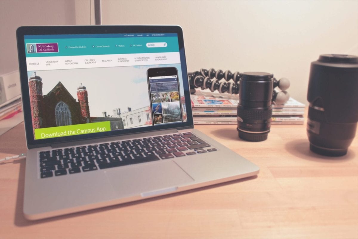
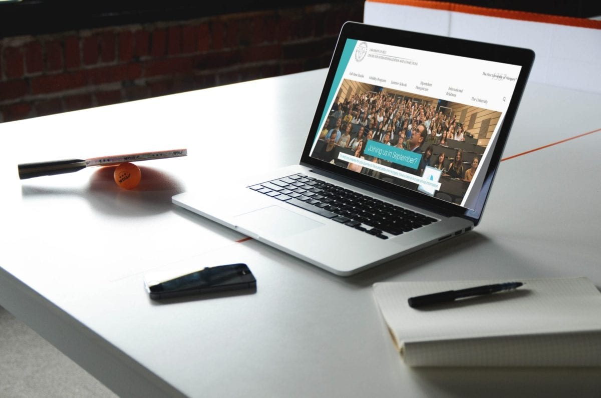
NUI Galway OE Gaillmh website design
NUI Galway OE Gaillmh’s website design is innovative because of parallax scrolling effect. This effect is very popular and gives movement to the website without having to add videos. The University made it even more simple for the students offering Campus App. It shows that the University spirit is moving forward with modernity. All the information being separated what makes the website even more attractive.
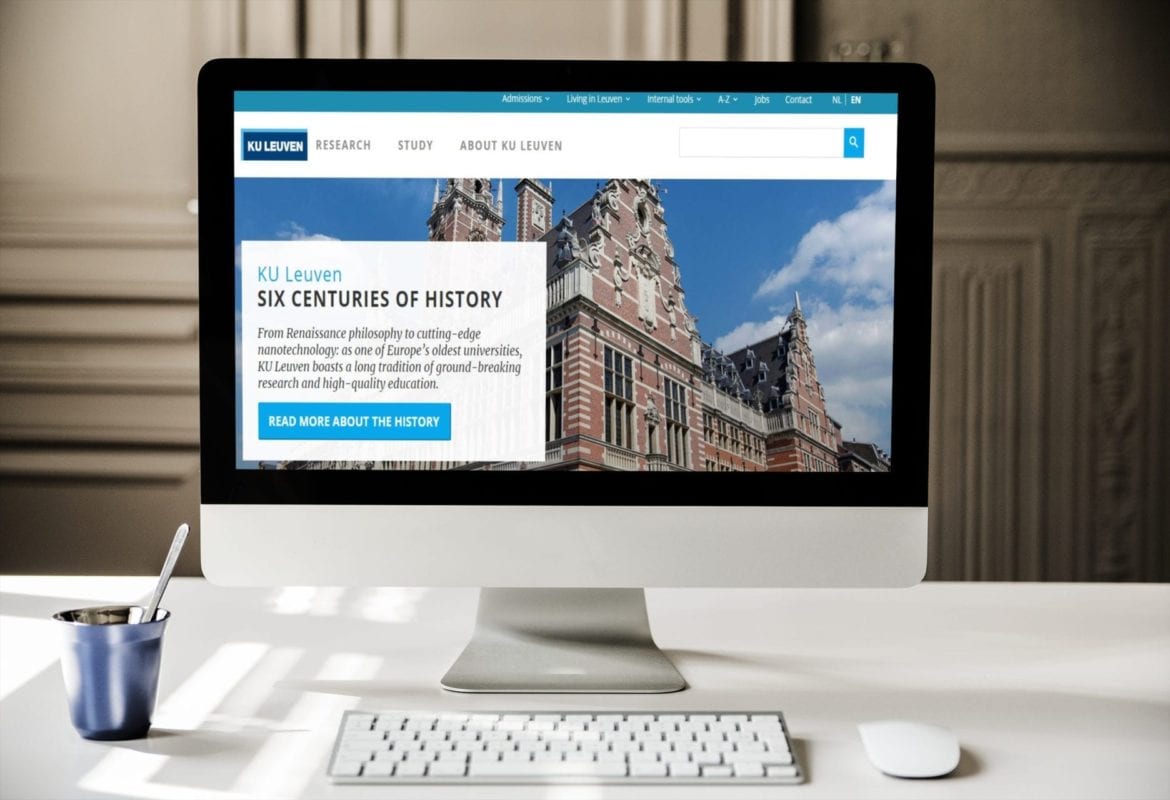
KU Leuven University website design
KU Leuven University’s website design looks very modern. It’s very easy to navigate for the new users. Every piece of information has its section which is separated in an elegant way. The colors are in harmony with each other and the page is not overloaded. The bottom menu is more expanded than the upper one. The website design is friendly for its users and makes them come back.
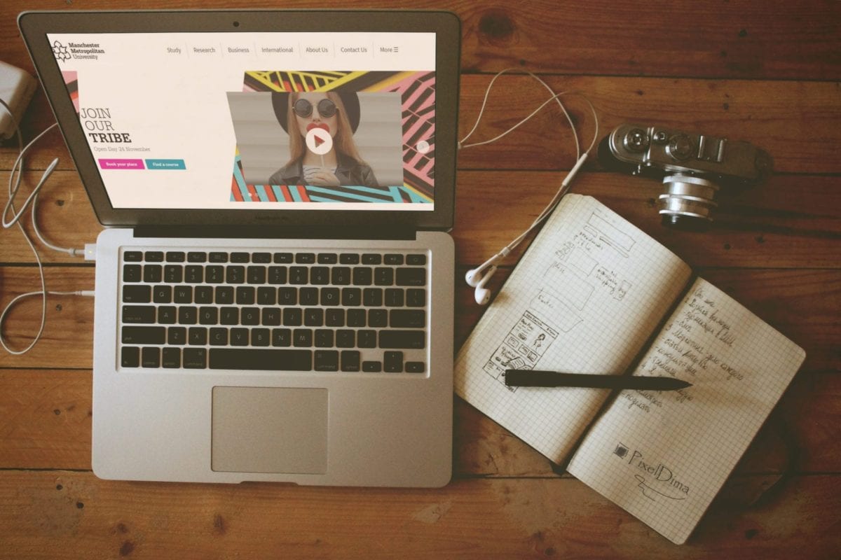
Manchester Metropolitan University website design
Manchester Metropolitan University’s website design is simple but elegant. The menu is also divided into two, one is organizational and the other one is more informative. The website subjects are divided into parts and is well-organized. Visitors don’t have a problem to navigate. The part with the slides makes the website more active and uses the latest feature; call to action buttons; which are very cool and persuade visitors to click. Personally, I like that the buttons have different colors it makes website design more interesting.
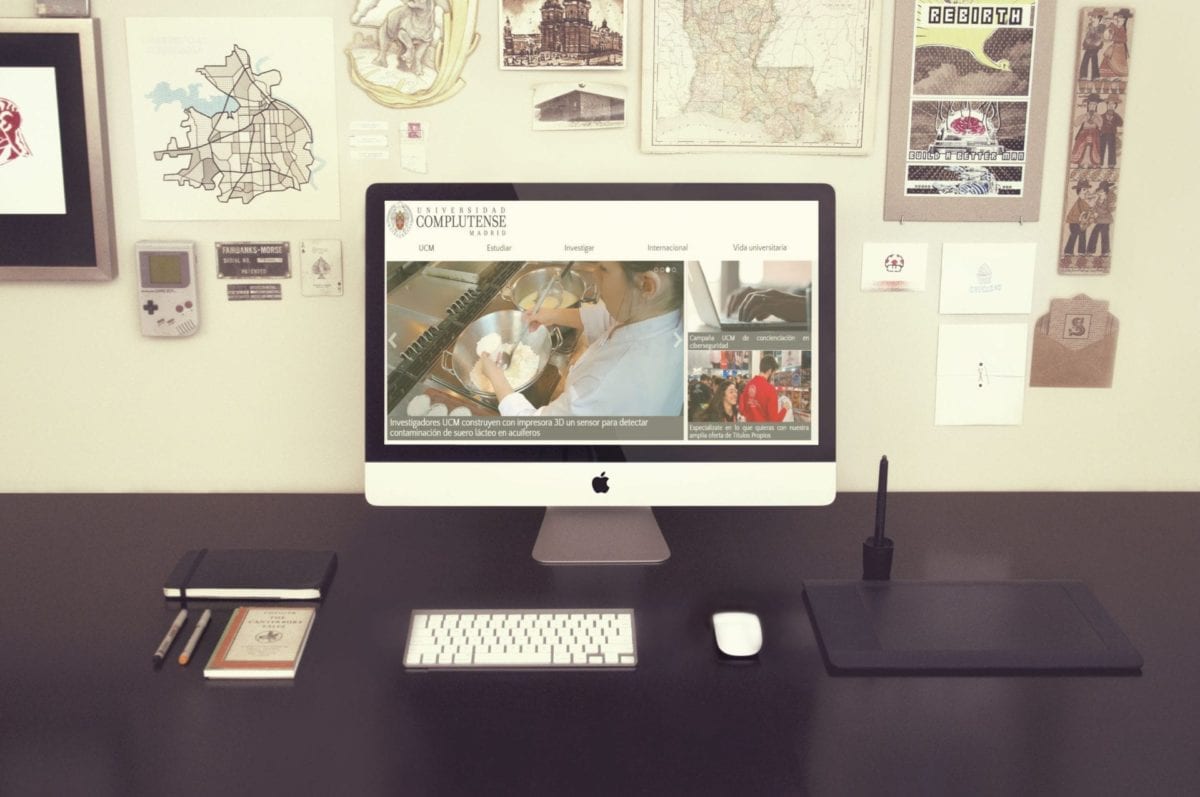
Complutense University of Madrid website design
Complutense University of Madrid’s website is consistent, informative and easy to navigate. The website is not overloaded with colors the background is white that makes it even more readable. The “News” slides is a great idea because it saves space and looks modern. The icon idea at the bottom of the page is really great because it explains what we can find after the click.
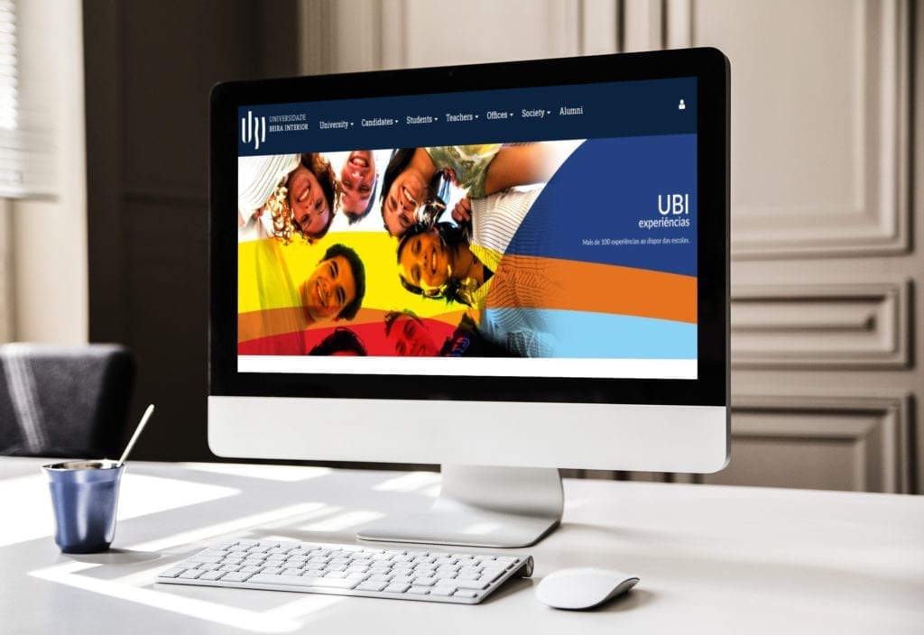
The University of Beira Interior website design
The University of Beira Interior’s website is condensed. It’s not overloaded with information and the menu has all the most important links so it’s easy to navigate. The photo of smiling students makes the website extra friendly and interesting. Colors are toned and every piece of information is sorted. The news section is divided into three parts and shows the latest news.
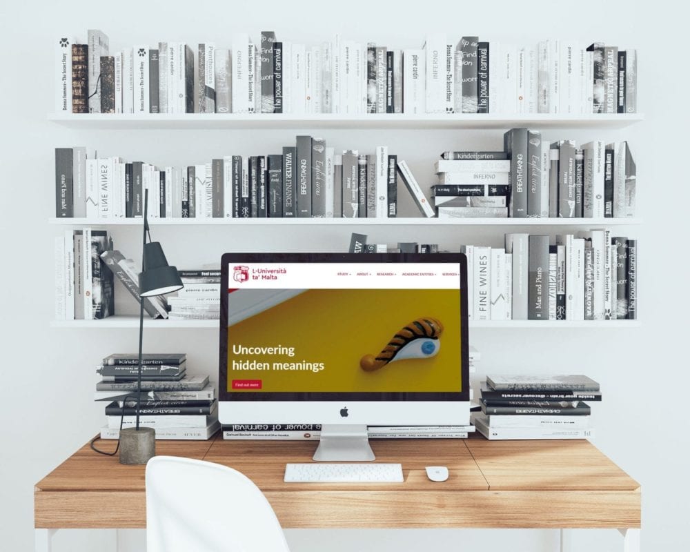
The University Of Malta website design
The University of Malta’s website has a bit more information in comparison to other websites but not too much text. There are two menus, one dedicated for students and staff, and the other one includes the most basic but important information. The search part is a good idea because it simplifies finding what visitors came to look for. The website is informative, clear, easy to navigate and the color is very friendly to the eyes.
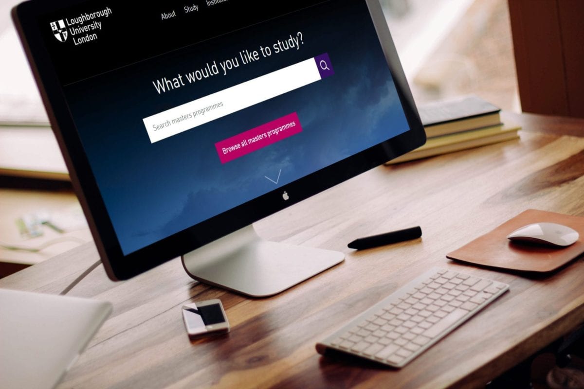
Loughborough University London website design
Loughborough University London’s website design has consistency and easy to navigate. The idea of the dark background going bright is interesting and makes visitors more interested to check the rest of the website. The menu is also divided into two parts informative and basic. There is not much text but the call to action buttons makes the design look more friendly and more tempting to click the button.
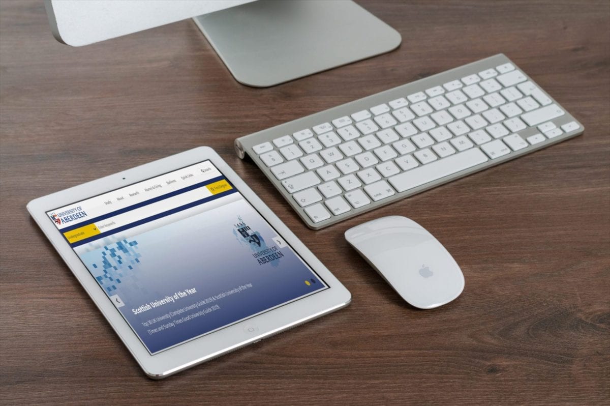
University of Aberdeen website design
University of Aberdeen website design is clear, simple and friendly to visitors. The website is more informative and displays mostly news and upcoming events. The video presenting the University and the city is a good idea especially to convince foreign students to study in the University of Aberdeen and show how beautiful this area is.
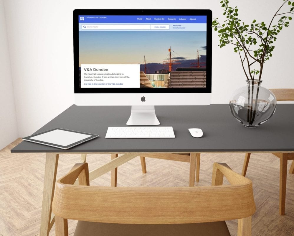
University of Dundee website design
University of Dundee’s web design is very user-friendly, especially to new users. All the information is easy to find for students and staff and in the first menu and the standard information for other users is lower on the page in the second menu. The website is bright and this is what makes it clear and easy to navigate. There is nothing that could distract the visitors.
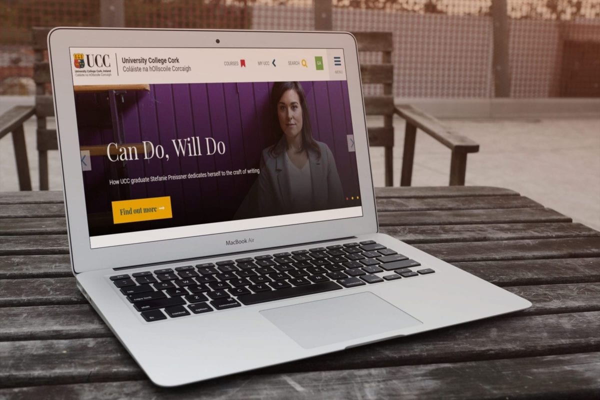
UCC University College Cork website design
UCC University College Cork’s website design is interesting and original. The University has put extra attention on call to action buttons and makes a game from colors to attract visitors. Every section is separated the first part displays slides, the second displays icons with explanations hidden under, then the news and action on social media.
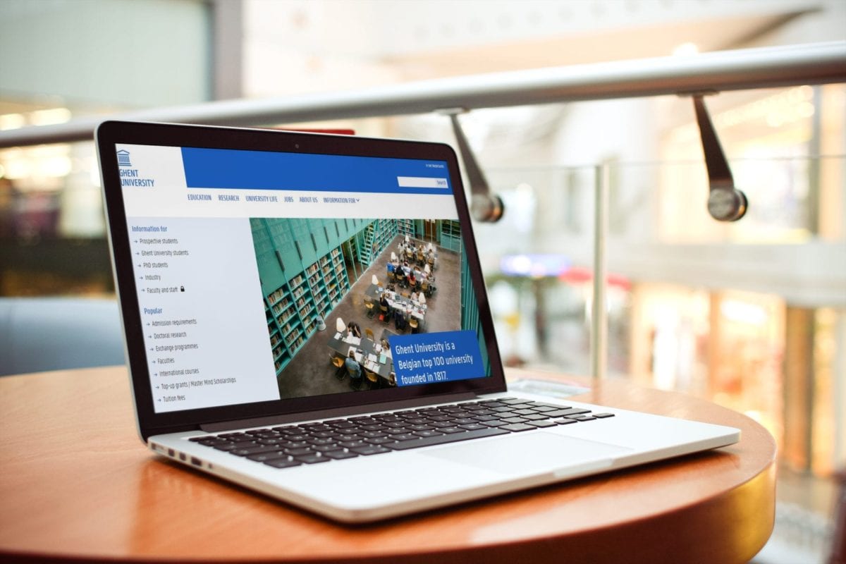
Ghent University Belgium website design
Ghent University’s web design is simple modest and modern. The website design encourages visitors into action. The base of the design is mostly on a specific blue chosen and divided into 5 sections main menu and bottom menu, informative, news,
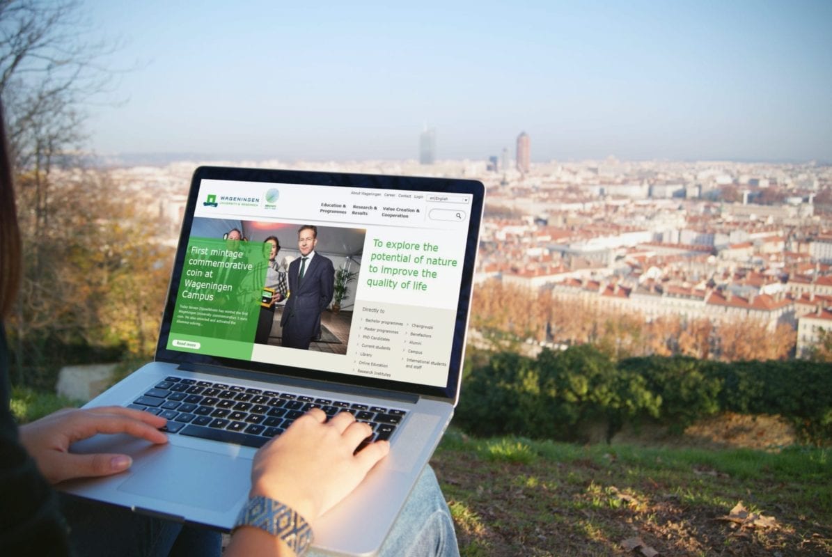
Wageningen University & Research website design
Wageningen University & Research’s website design is simple and quite interesting with its eco theme. Their slogan is “To explore the potential of nature to improve the quality of life” and the idea to add green is brilliant because it harmonizes with the subject. The website is very light, navigation is easy. The way how news is displayed is also very good for the eye and the website is well-organized.
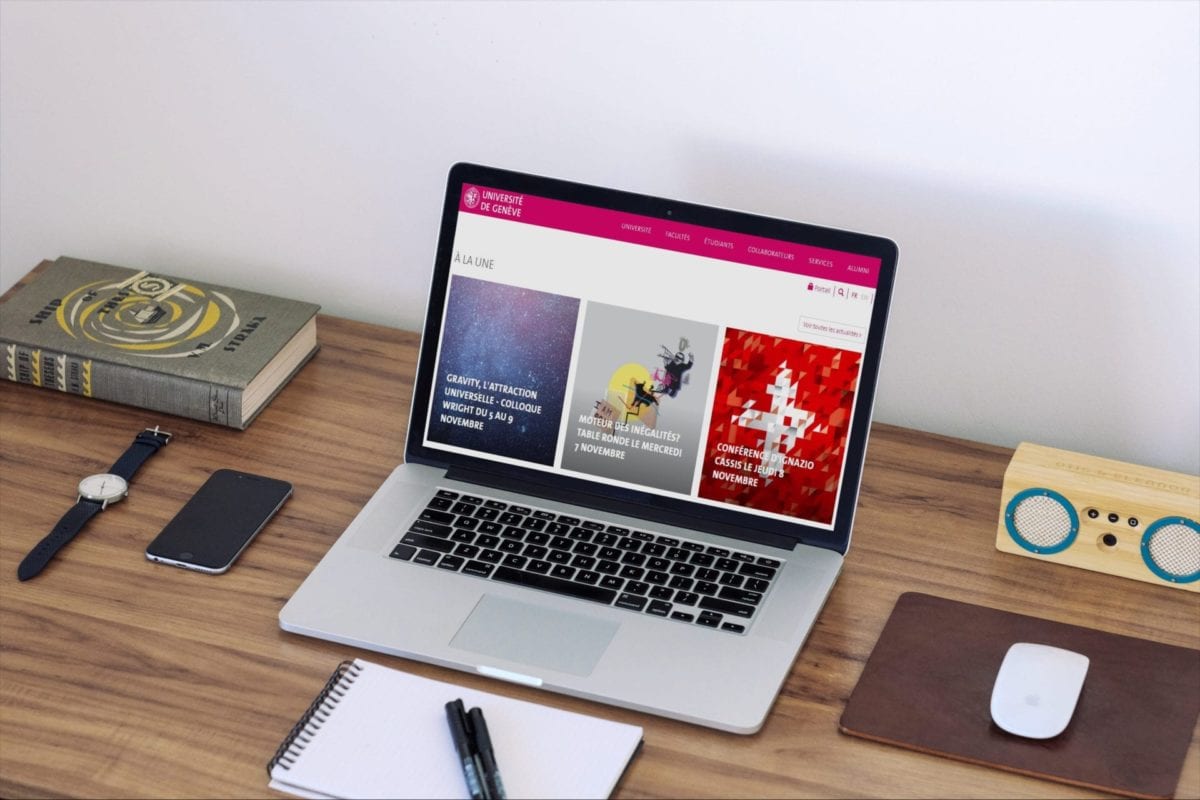
University of Geneva website design
University of Geneva website design looks modern. All the most important information is separated and it is very good for navigating to what visitors really like. The University offers a very interesting feature; the mobile application. The idea is great because all the students or future students are using their phones almost 24/7 and that means the University cares about students needs. The website is harmonized, not overloaded and friendly for the visitors and has a definite social media feel.
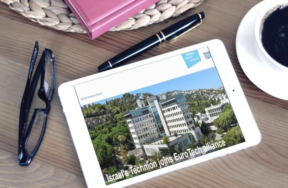
TUM Technical University of Munich website design
Technical University of Munich’s website design is minimalistic. The dominant color is blue like the logo of the University. The images visualize technical professions and the subject of the slides says what the university is about. The bottom menu is expanded and visitors can navigate there easily. The idea of the website design is well thought through.
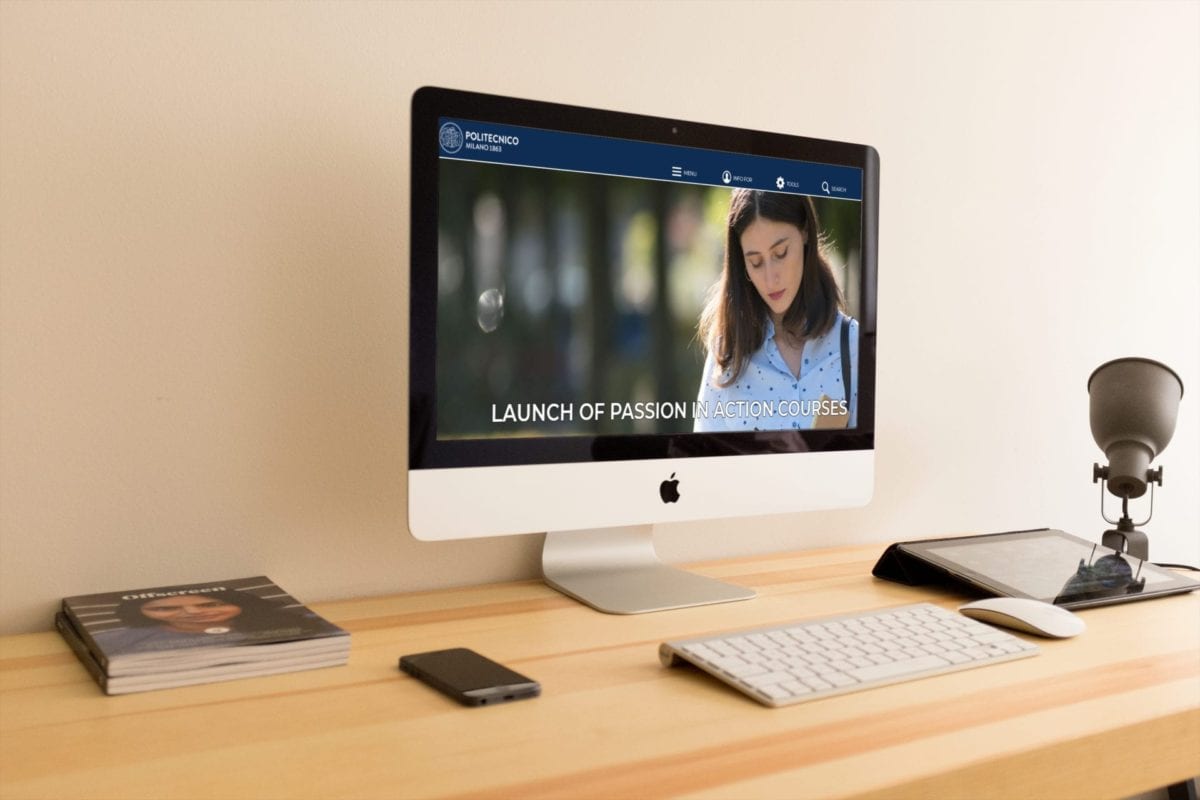
Polytechnic University of Milan website design
Polytechnic University of Milan’s website design is simple and professional. The website’s simplicity makes it easy to navigate. Visitors can easily find all the information they are looking for in the menu. The slides display the most important news and call to action buttons make visitors click and stay a bit longer than usual.
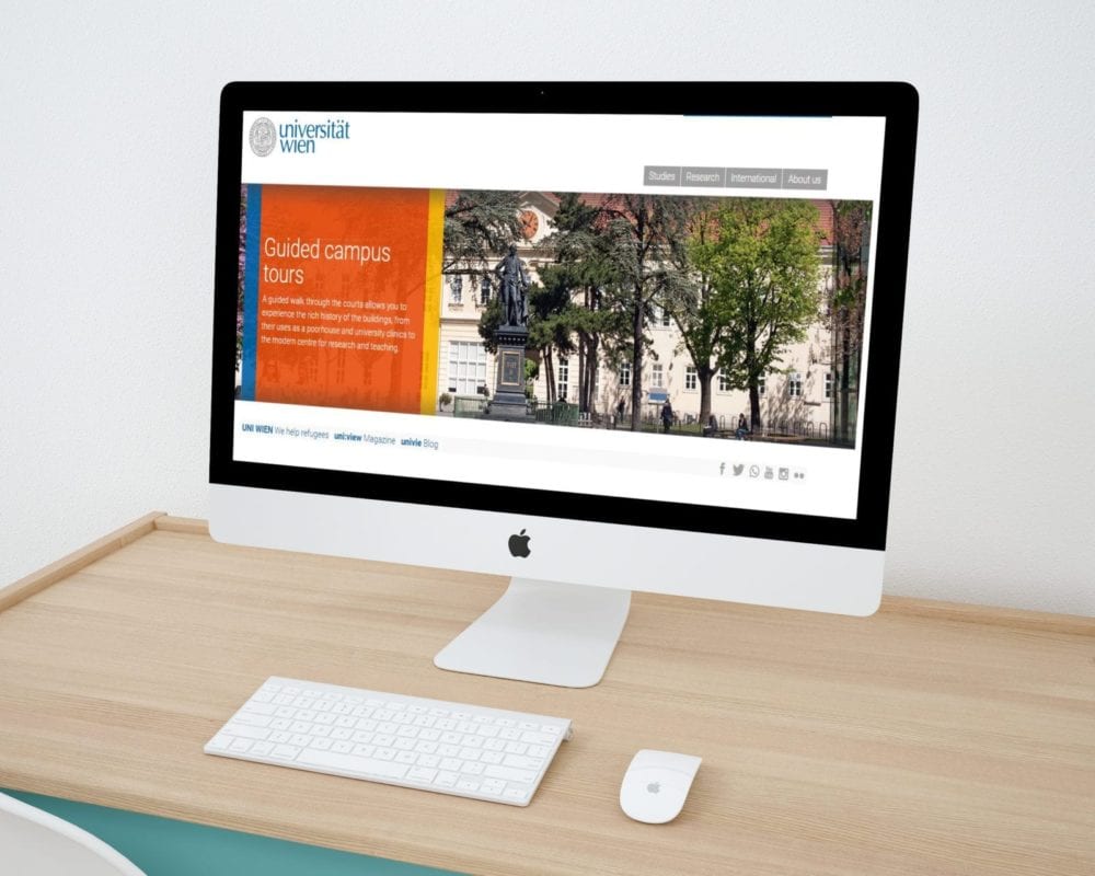
University of Vienna website design
University of Vienna’s website design is well-organized. All the sections like “News” or “Events” have titles on the top that are separated by a horizontal line. The number counters are also a great idea to present the numbers. The bottom menu is quite original because has “Most searched-for services …” it saves time because visitors don’t need to look for the information it’s waiting for them to click. The website is also clear, harmonized and easy to navigate.
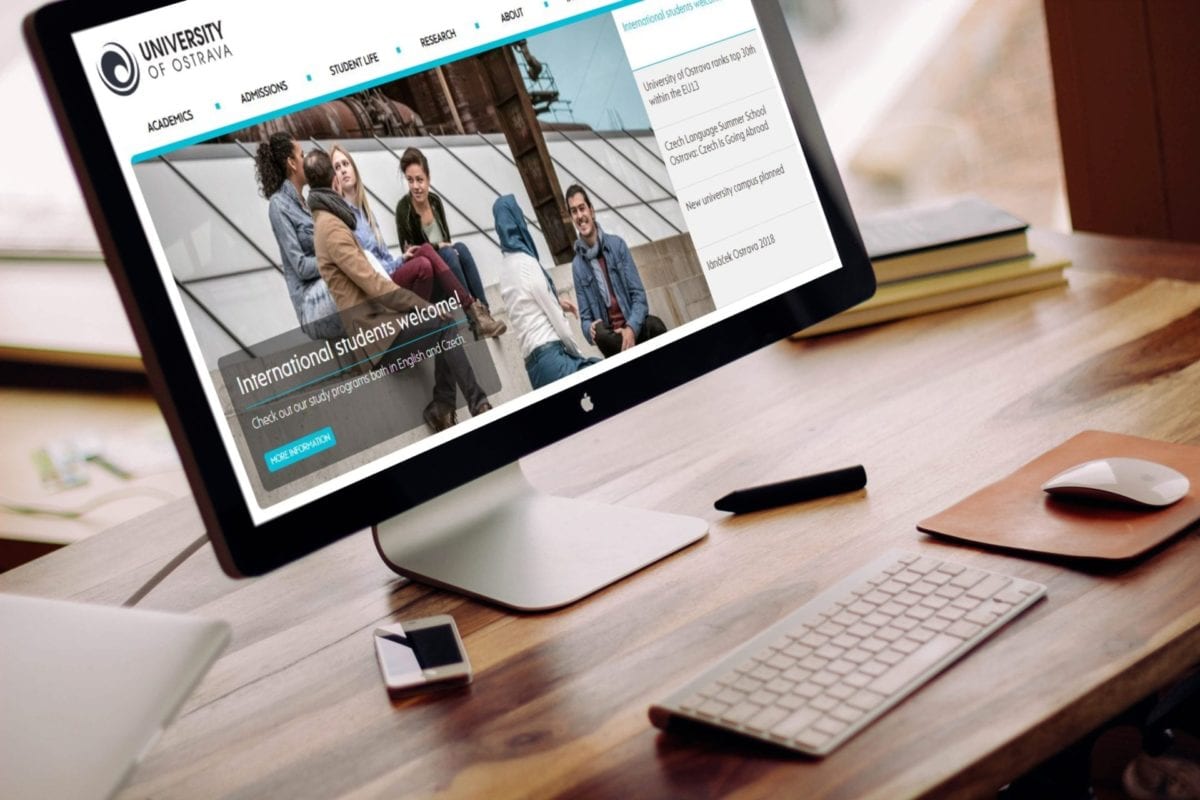
University of Ostrava website design
University of Ostrava’s website design is modern and adapted to students/users needs. The design is up to date all the information added to the page is sorted carefully to not overload it. The idea of the boxes with icons is practical and it’s not taking too much space. Bottom menu is more expanded and the visitors have no problem to surf. The colors are light and navigation is easy.
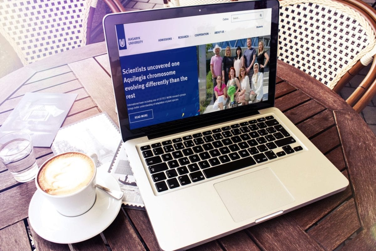
Masaryk University website design
Masaryk University’s website design is well-organized doesn’t have too much text. All the important information is separate, through color blocks. The colors are harmonized what makes the website design even more clear and nice to read. Call to action buttons are also a very good solution because they guide users and make navigation easy.
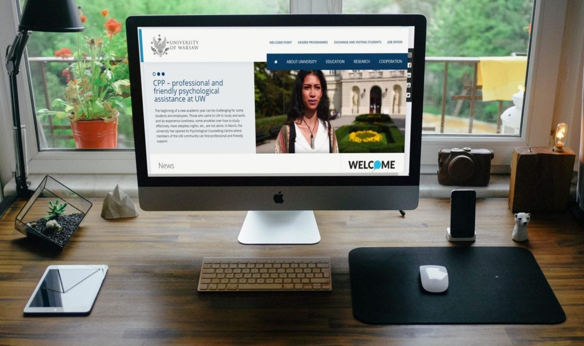
University of Warsaw website design
University of Warsaw’s website design is minimalist has only the most important information included. The most important information is placed on the main, secondary and sidebar menu.
There is also some movement on the page caused by “News” section. The idea is great because it’s not overloaded but informative.
University of Pécs website design
University of Pécs’ website design is very well-organized. All the sections are separate so the navigation is easy. The first section is the informative slides then news and events, full degree programs (displayed in a very nice way), YouTube videos (University commercials), university statistics in numbers (Universities success displayed in numbers and icons), and the last part social media section. The visitors definitely wouldn’t have a problem with the navigation on the website and design is great.
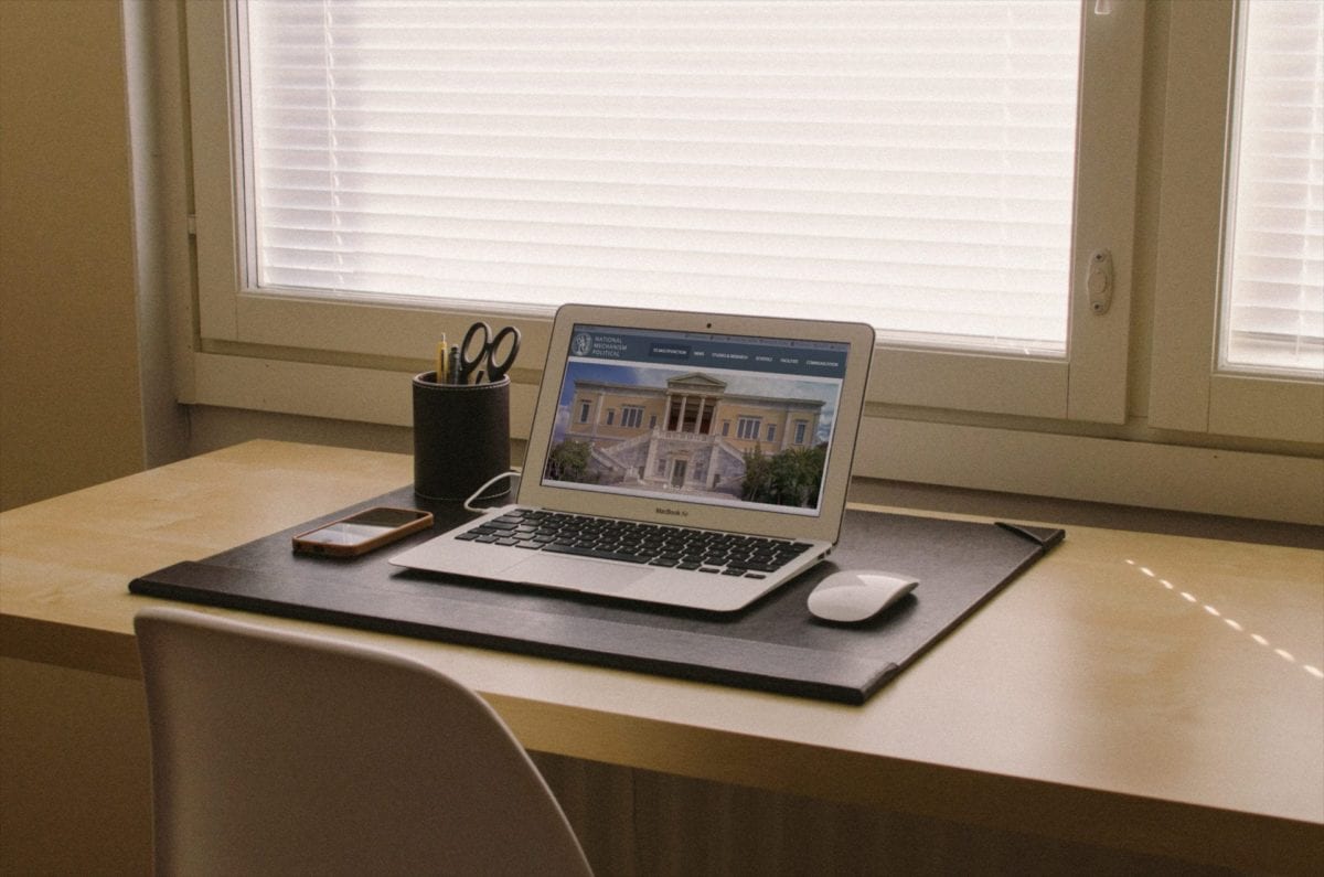
National Mechanism Political website design
National Mechanism Political’s website design has a strong visual style because of the images which illustrate all the information. There is not much text only were needed like titles or small descriptions. The images in “The schools of political ” section has the same filter what makes them look professional. There are two slides sections which make the website more interesting. The idea of Google Maps showing the location is innovative. The website itself looks very well-organized so the visitors can navigate easily.
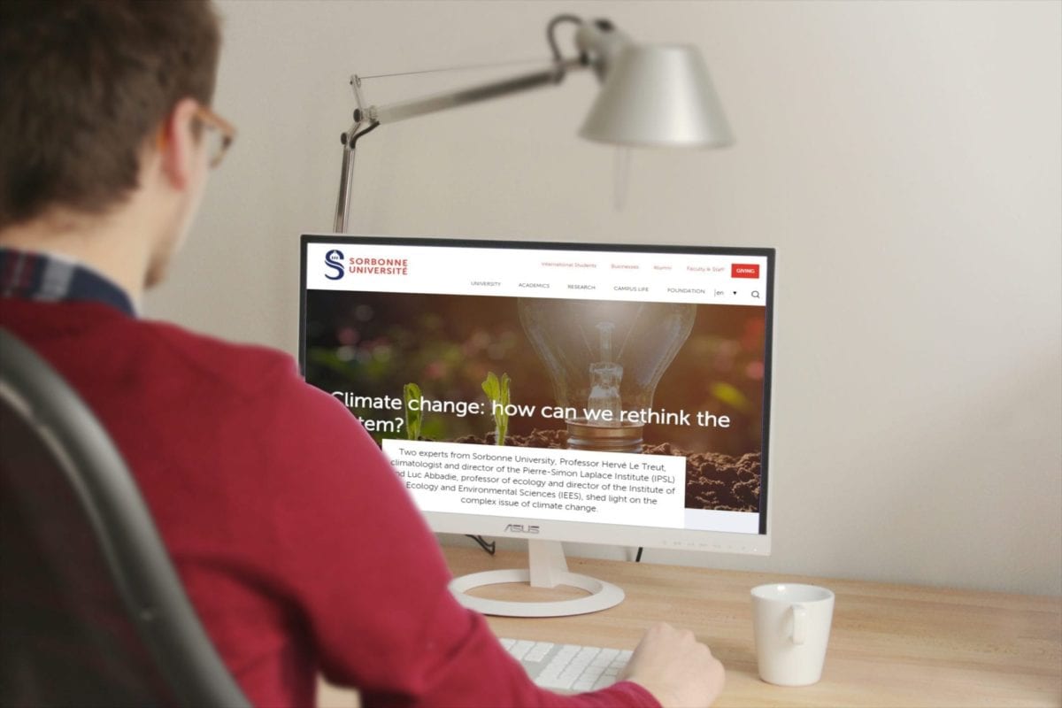
The University of Sorbonne website design
The University of Sorbonne’s website design is very cool. The “messy student“ style layout on the website interests visitors and makes them more interested and want to stay longer. The “News” section looks chaotic but really interesting. A smart move in design is to add call to action buttons because they redirect visitors to the specific subjects that they are interested in. There is also a number counter section which presents important numbers which the University is proud of. The website design is a little chaotic, but this gives the contents dynamics that are interesting and easy to navigate.